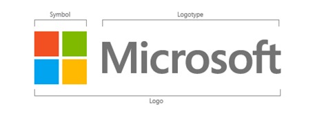
After 25 years, Microsoft has redesigned Microsoft Logo. The new logo is inspired from Microsoft Products four colours design principles.

The Year 2012, a Microsoft’s year, nearly all of its products are going to be reimagined and released within 2012. A Common look and feel of all products from Windows to Windows Phone or Xbox to office, and having seamless experience on various platforms are the key goal of Microsoft. Not only the products, Microsoft official Logo has also evolved.

The New Logo has build using two components:
LogoType : Microsoft has used Segoe font, a common font used in all products of Microsoft as well as for Marketing communication.
Symbol : The symbol’s squares of color are intended to express the company’s diverse portfolio of products.
Starting today, you’ll see the new Microsoft logo being used prominently. It will be used on Microsoft.com, Microsoft retail stores, Television ads globally. And it will support Microsoft products across various forms of marketing.

