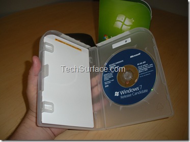
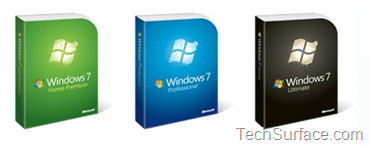
On 23rd June, Microsoft Officially Confirm the Windows 7 packaging box art design. The box is pretty simple clean design, easy to open and reduce waste.
Simple Design
Customers told us they liked the big bold Windows logo and how it clearly communicates that it’s Windows 7. They like larger typefaces to make it easy to read. They also like the background colors for each edition that make it easier to differentiate between Windows 7 Home Premium all the way to Windows 7 Ultimate. In their own words, the “clean” design gives off a “fresh” feel.
Make It Easy To Open

We’ve reduced the number of elements in the package down to three: the plastic case, the paper sleeve, and a simple Getting Started Guide. The plastic case opens easily like a standard DVD case and it will have a single easy-to-remove seal at the top – and that’s it!
Reduce Waste
The plastic case protecting the Windows 7 disk is lighter and is recyclable. The packaging itself has a 37% weight reduction and the econometrics score has improved by 50% over it’s predecessor.
Essentially, the packaging is what customers told us they were most interested in picking up to learn more about Windows 7. We hope you do the same.
Look for the new Windows 7 packaging to hit this fall!


